Ashwood Tattoo Studio was a new tattoo shop entering an incredibly competitive industry and looking to establish a distinctive identity from day one. Rather than leaning into familiar tattoo-shop tropes, the goal was to create a brand that felt timeless, adaptable, and rooted in deeper meaning.
How did this project begin?
Ashwood Tattoo Studio came to us through connections in the music and alternative culture world that we’d developed over the years. The studio was just getting started, and founder Chris Youngblood was looking for branding that could help distinguish Ashwood from countless other tattoo shops competing for attention.
What immediately stood out was that they weren’t looking for something that screamed “tattoo shop”, nor were they interested in doing what every other shop was doing with their brand.
What was the challenge?
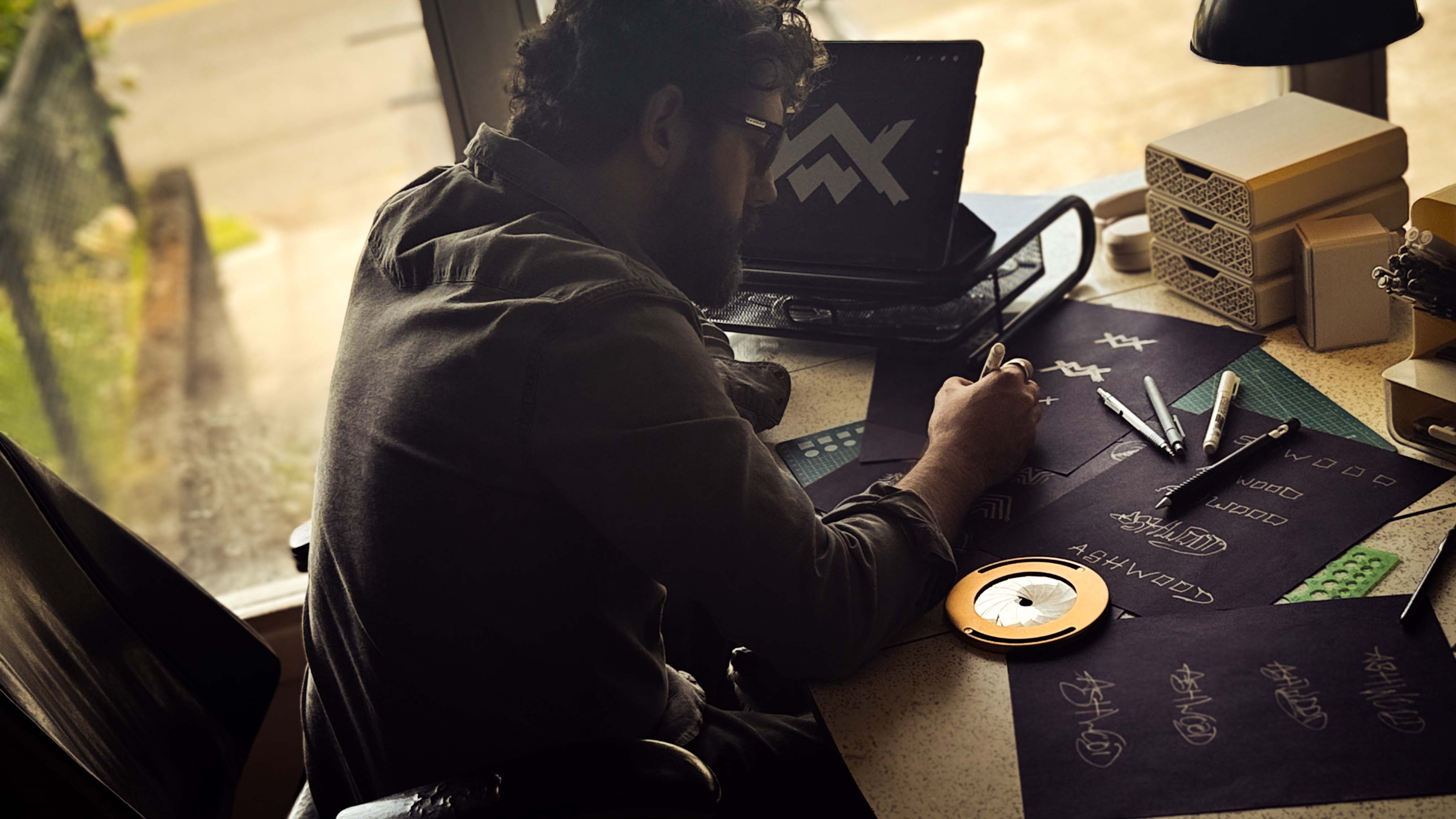
The biggest challenge was avoiding clichés. Tattoo shops often fall into familiar territory, certain fonts, symbols, and visual shorthand that we actively avoided.
The challenge became: How do we create a tattoo brand that feels authentic to tattoo culture without looking like every tattoo shop on the block?
Another consideration was future growth. A tattoo studio often has many different styles under one roof, and the identity shouldn’t be so specific that it boxed the studio into one particular aesthetic forever. The logo needed room to grow.
What was your approach?
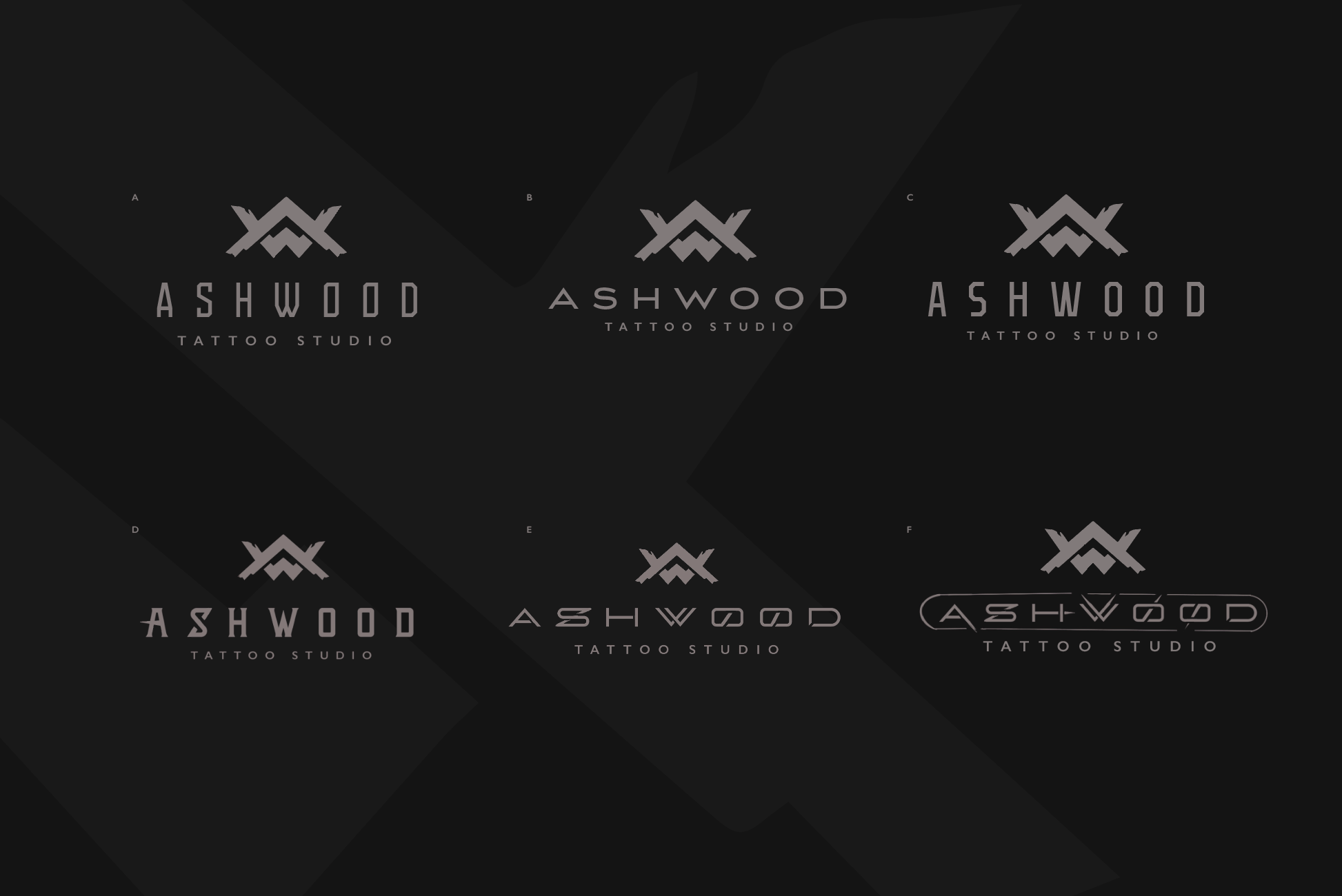
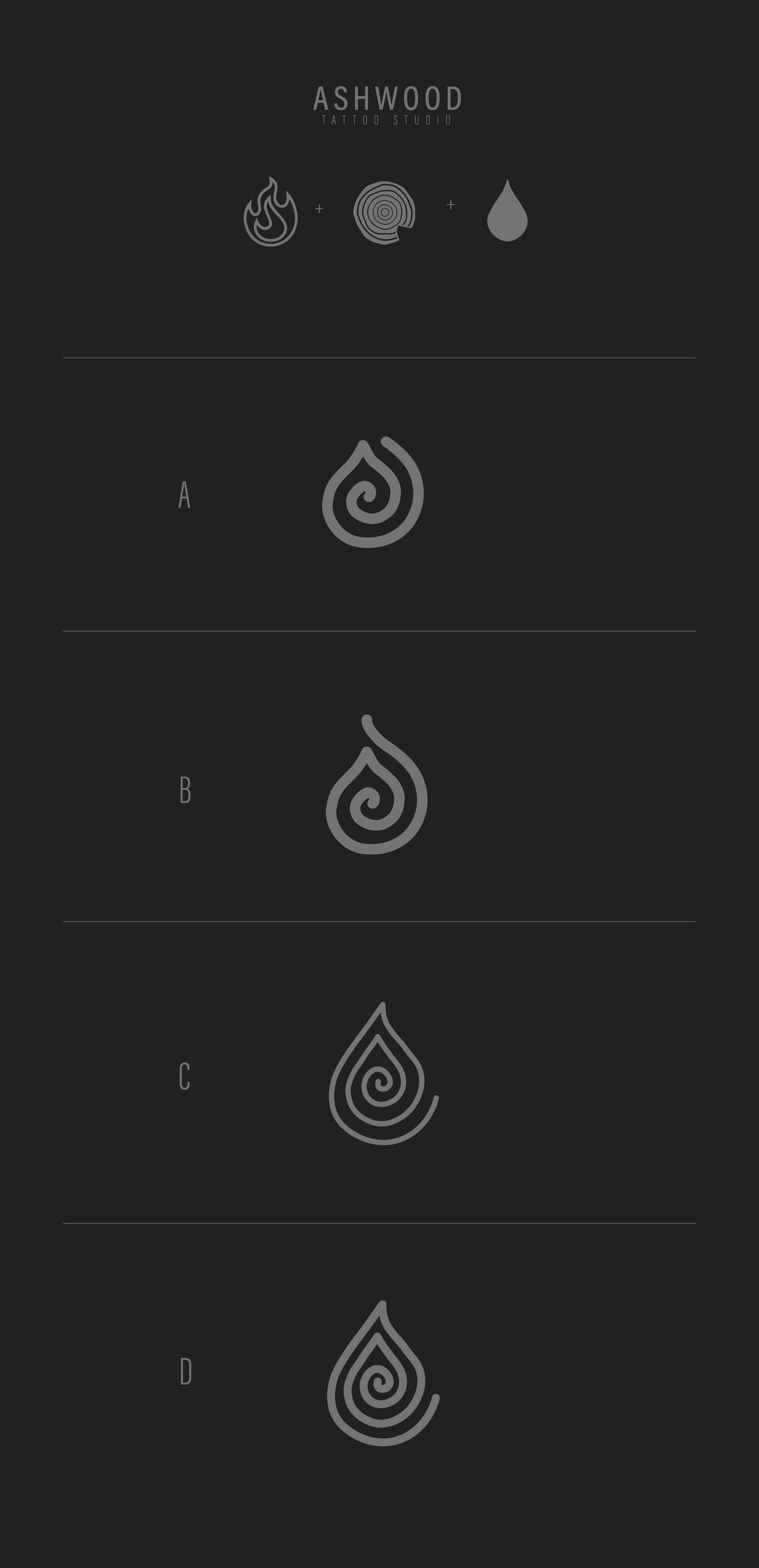
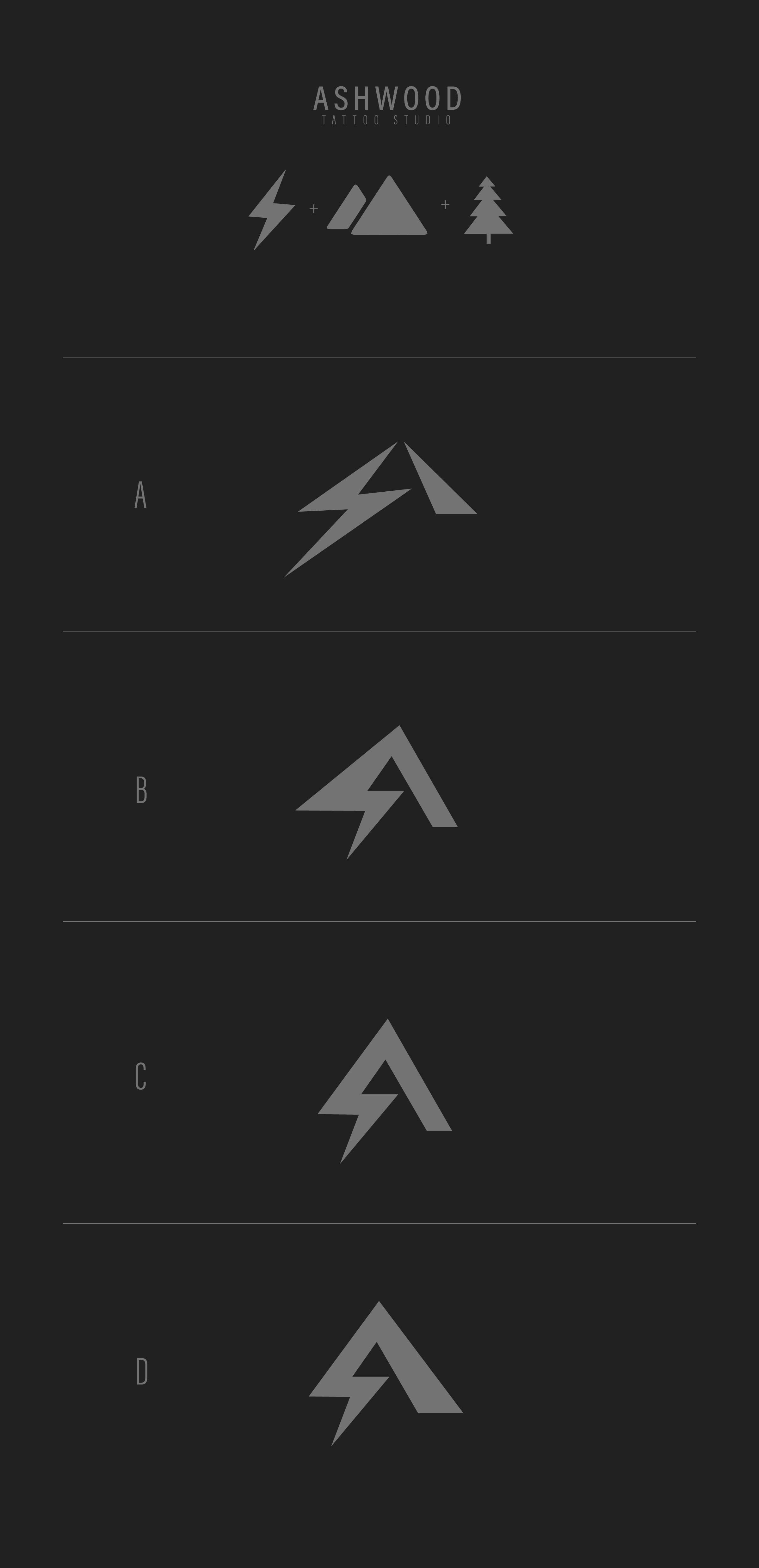
The name itself became the starting point. Ashwood immediately made me think of transformation, ash, wood, fire, destruction, renewal. The cycle of things ending and becoming something new. That felt aligned with tattoo culture. Tattoos are often markers of change. Personal transformations and new chapters.
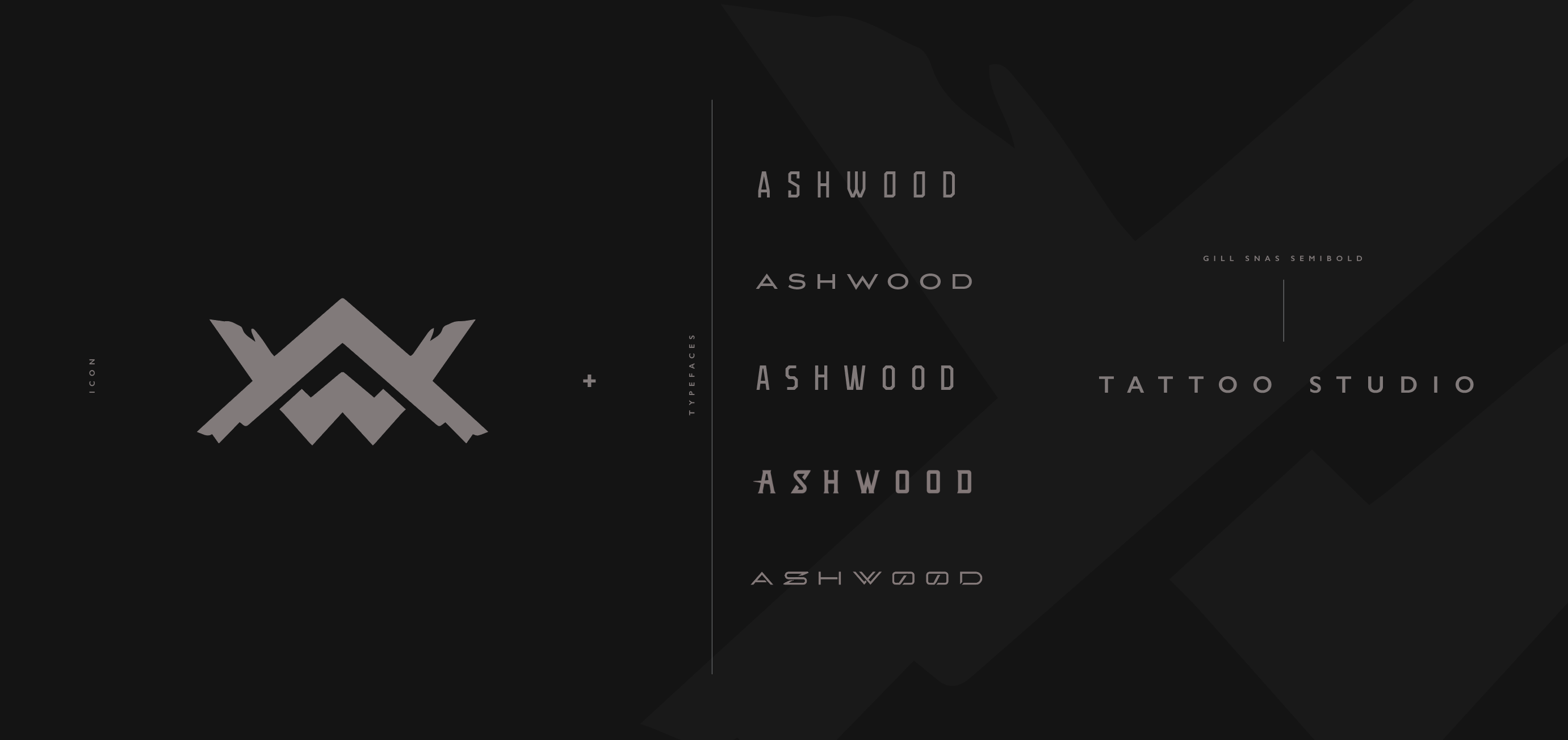
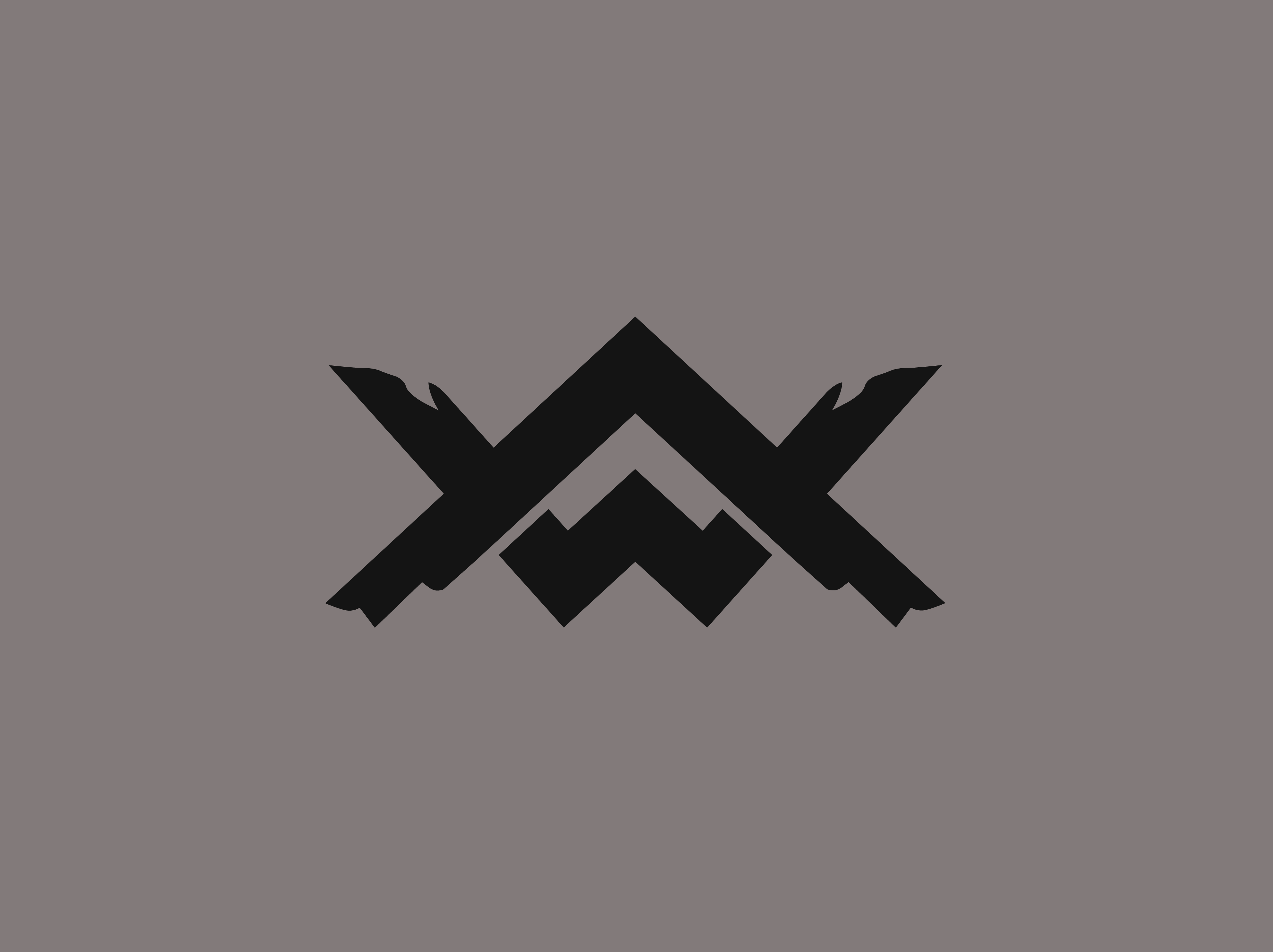
I wasn’t interested in creating a logo that literally explained tattooing. I was more interested in creating something that reflected the spirit behind it. The final direction leaned into those ideas through a monogram-based mark that incorporated the A and W while drawing inspiration from wood forms, burned structures, and the visual language of renewal.
What was your role?
I developed the primary logo mark from scratch and built the broader identity system around it. That included:
- Logo design
- Illustration
- Typography selection and refinement
- Brand guidelines
- Apparel applications
- Merchandise concepts
- Social media animations
- Identity development
How did you know it was working?
For me, the proof came through longevity. Once the identity launched, it was adopted across the studio’s social media, merchandise, and marketing materials almost immediately. Years later, it’s still there. The studio has grown, the business has matured, and the brand is still going strong.
That’s one of the most rewarding outcomes a designer can hope for.
Why does this project matter?
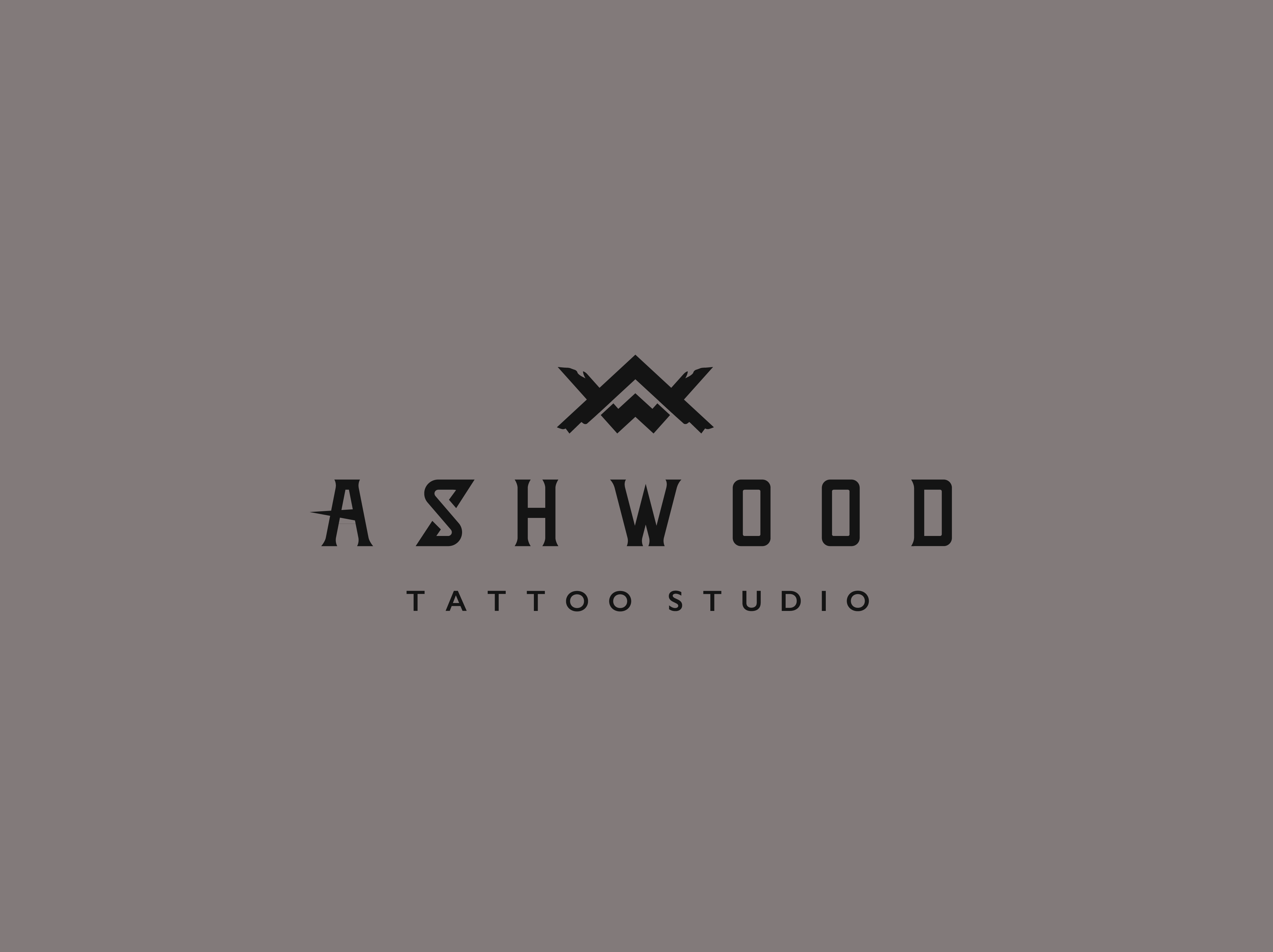
Ashwood represents something I care deeply about in branding: creating identities that can evolve alongside the people using them. A lot of logos are designed for the present moment. This one was hand crafted and designed for the years that would follow.
Like the ink on the skin of Ashwood’s clientele, the mark will last a lifetime.