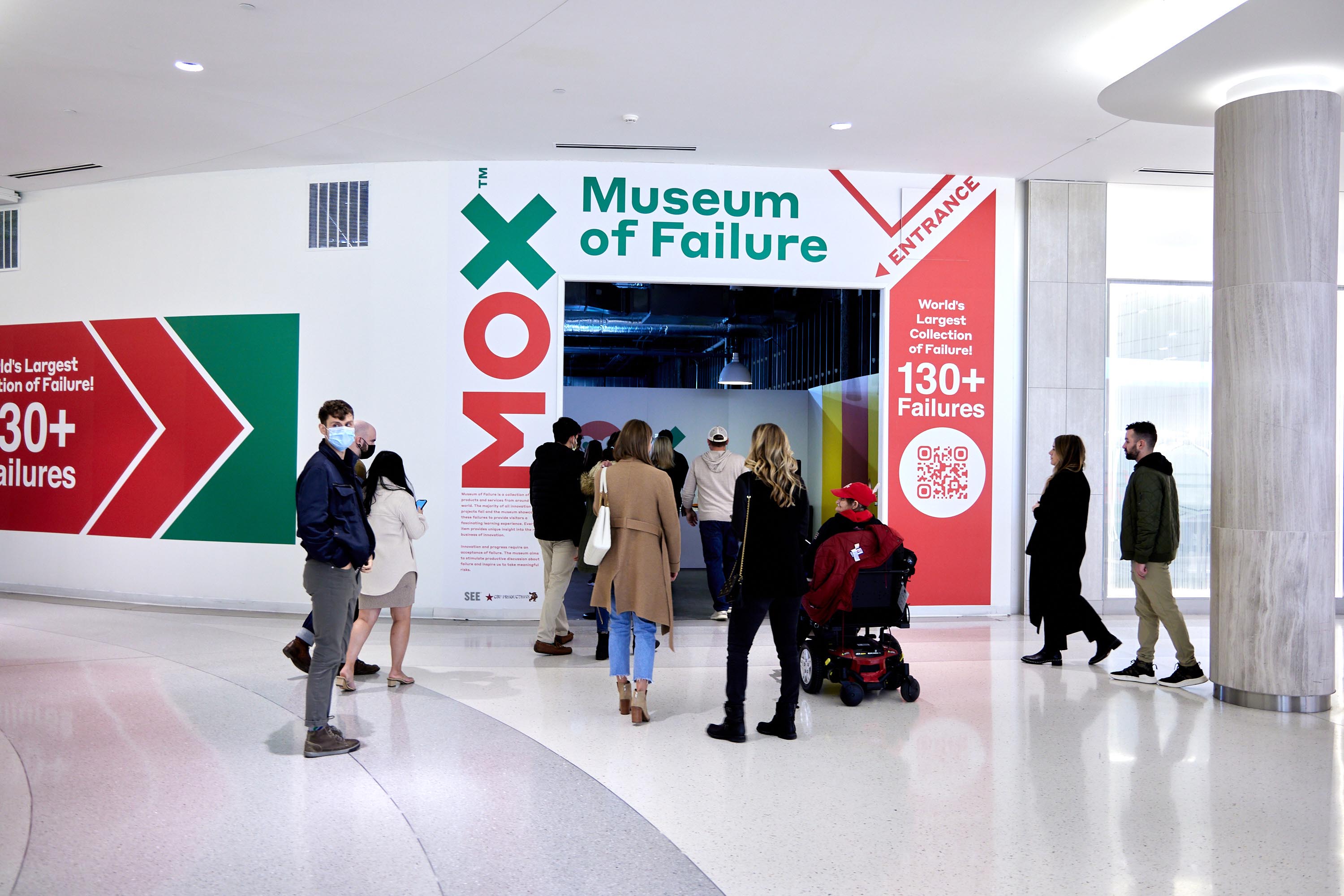
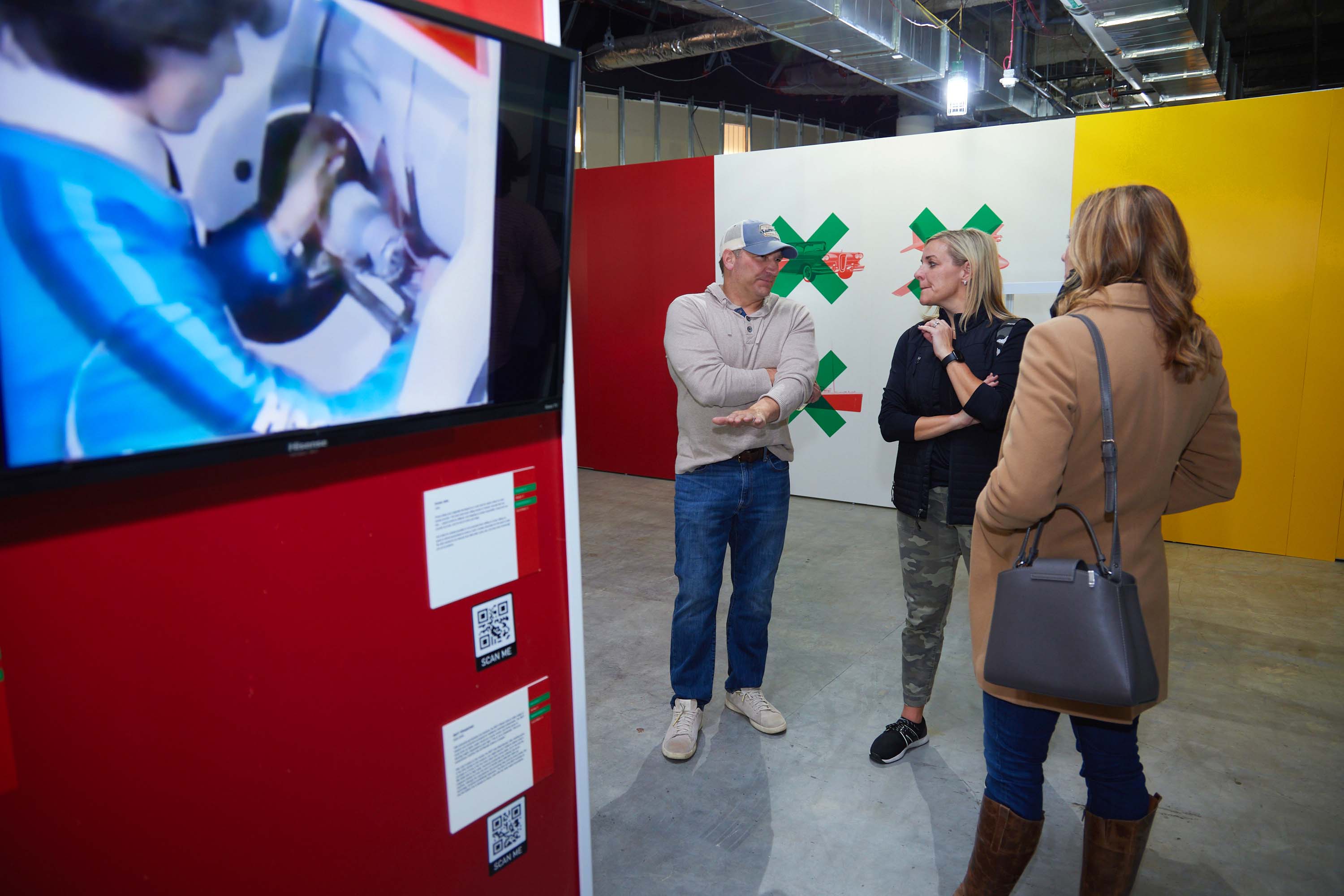
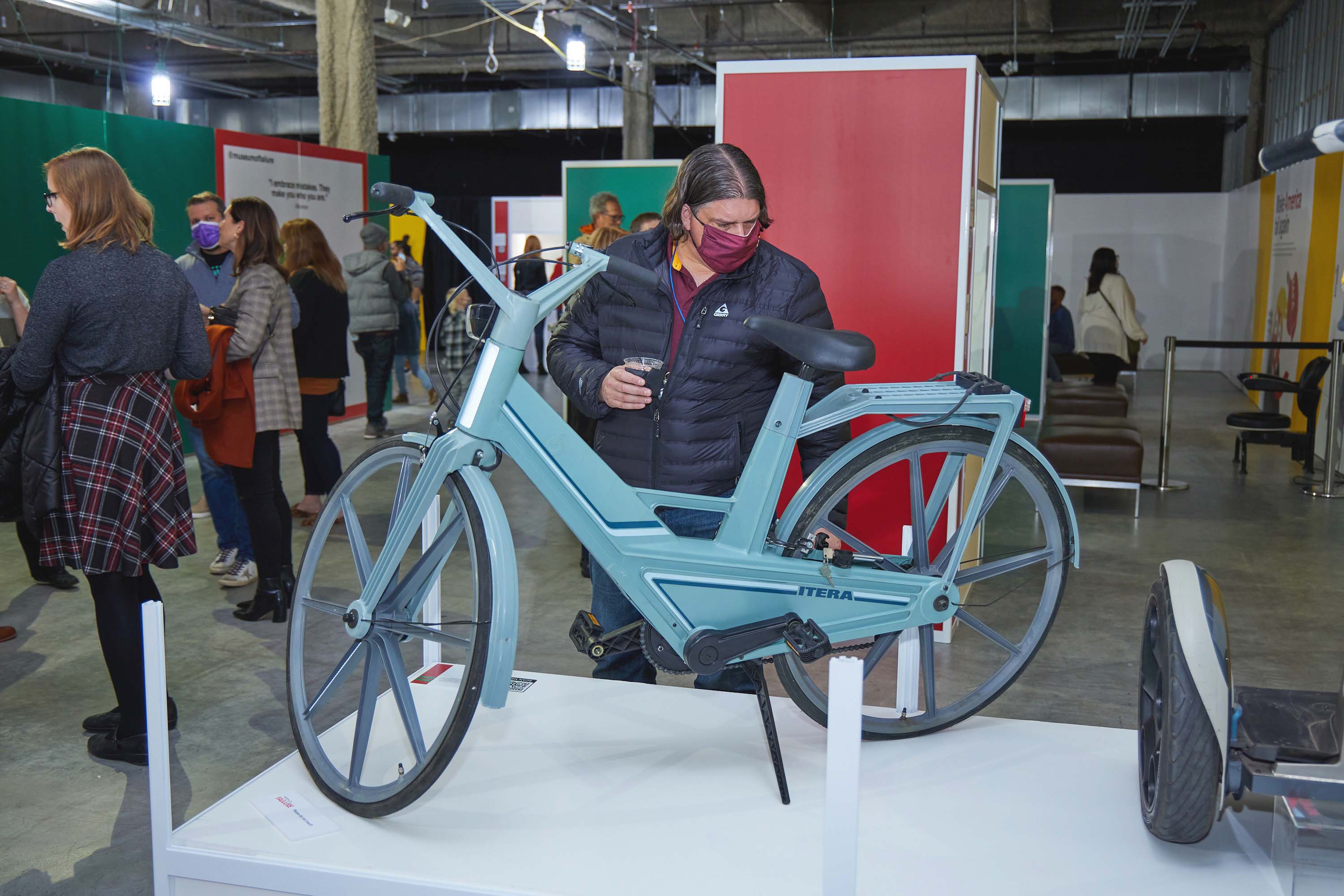
Museum of Failure is a traveling exhibition dedicated to some of the world’s most fascinating commercial missteps, product flops, and ambitious ideas that never quite worked out. What began as a simple illustration assignment quickly became an opportunity to contribute to a globally recognized exhibition that celebrated experimentation, risk-taking, and the value of failure itself.
How did this project begin?
Museum of Failure came onto our radar through our longtime collaborators at See Studios, who had worked closely with Fluxar Studios on a variety of projects over the years.
The idea was simple and brilliant: create a museum dedicated entirely to failure. Most museums celebrate wins and achievements, but this was a traveling display celebrating gigantic missteps in various sectors including arts and entertainment, tech, and politics. Ironically, years before, a friend and I had talked about starting a podcast with a very similar premise. When Museum of Failure landed on my desk, I instantly understood the appeal.
What was the challenge?
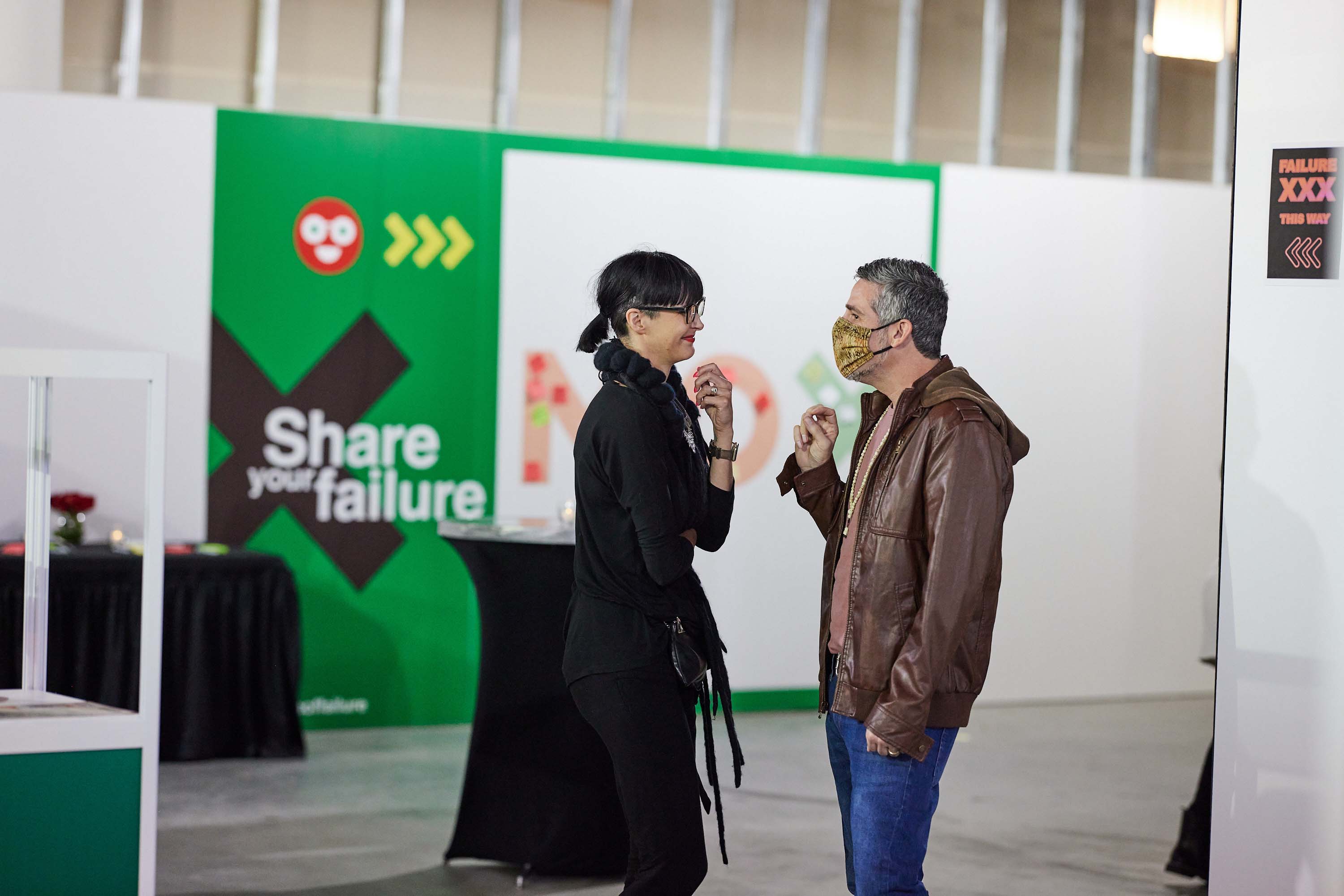
The biggest challenge was actually the limitation. Museum of Failure already had an established visual identity and were tasking us with enhancing what was already there.
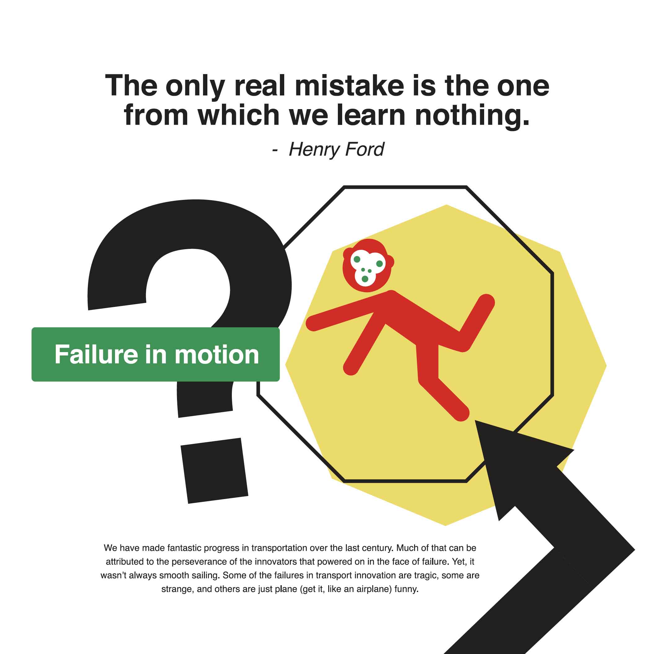
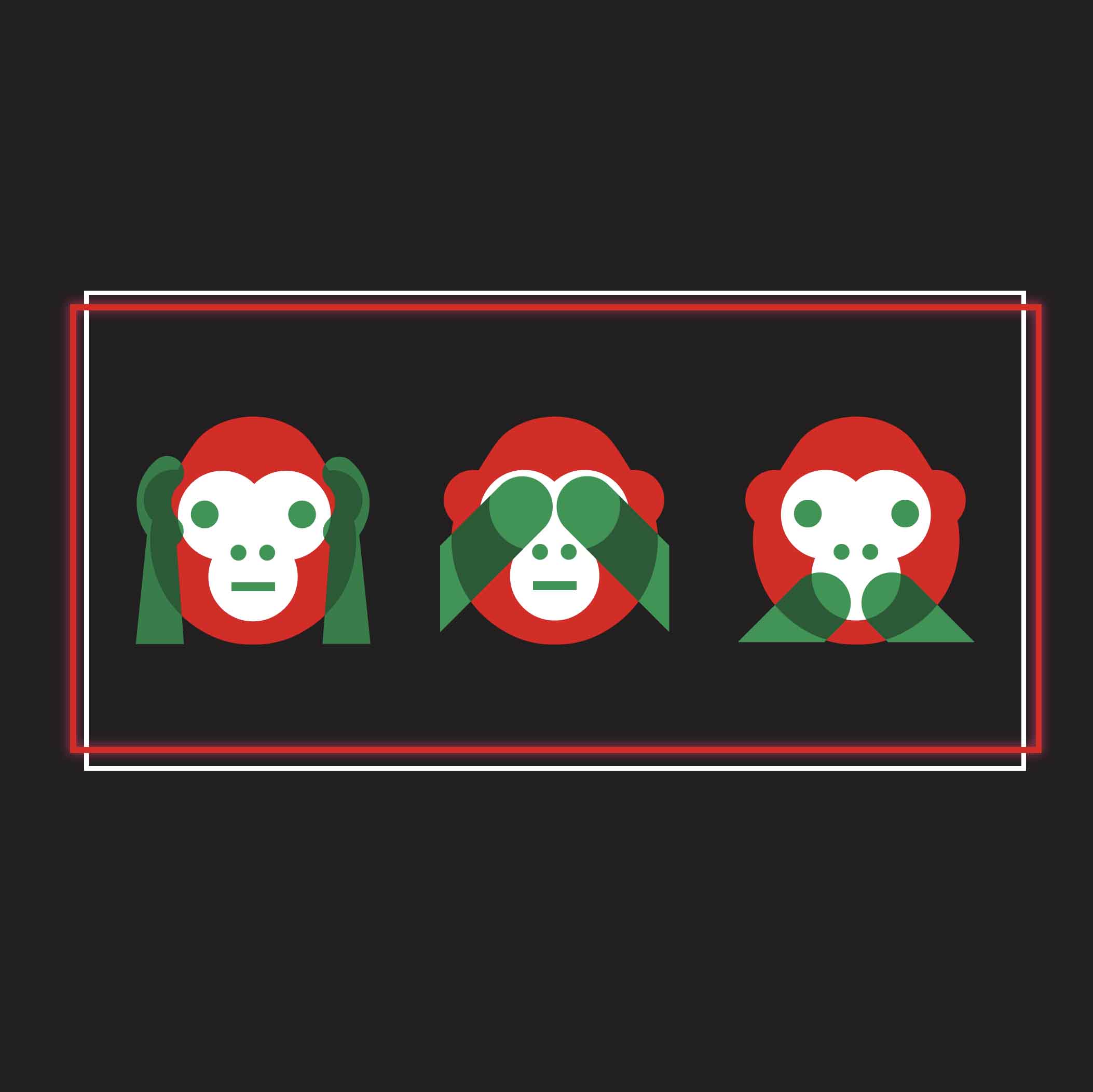
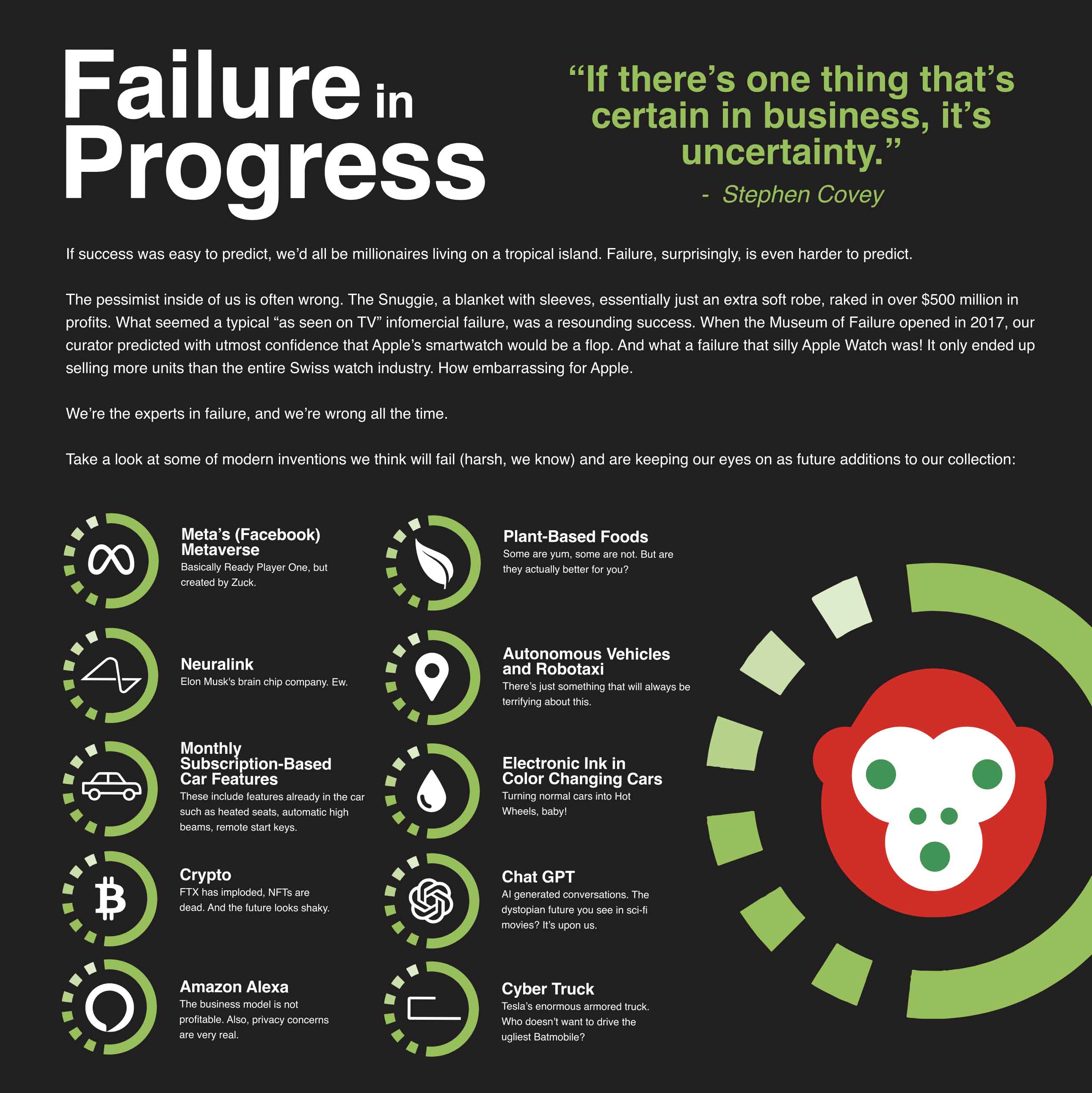
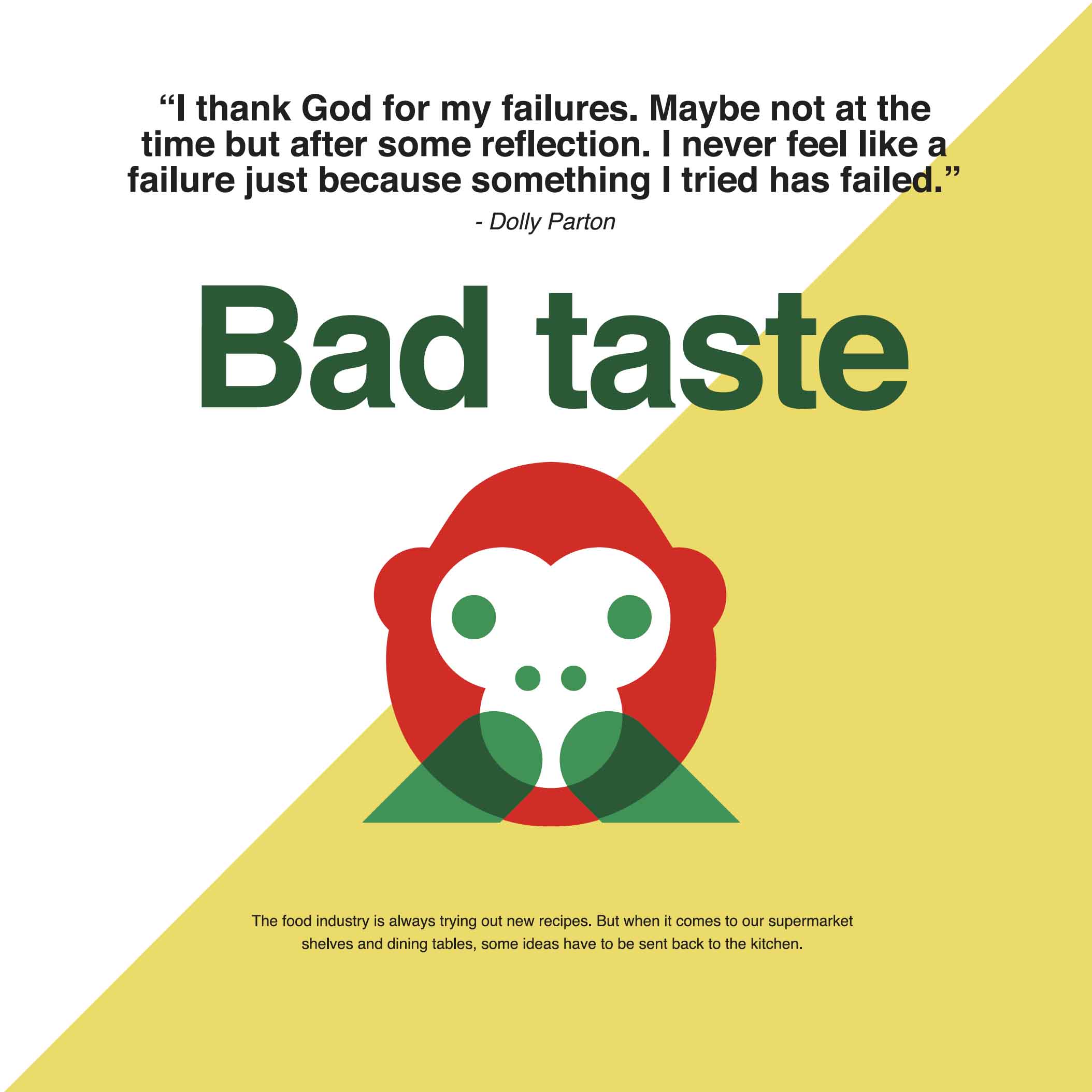
The color palette was extremely limited, Green. Red. Yellow. White. Black. That was basically it. The illustration style was also tightly defined, existing within a simplified, almost iconographic, emoji-like visual language.
As somebody who naturally gravitates toward more detailed and expressive illustration, I couldn’t rely on any of my usual tricks. I had to work inside their system.
What was your approach?
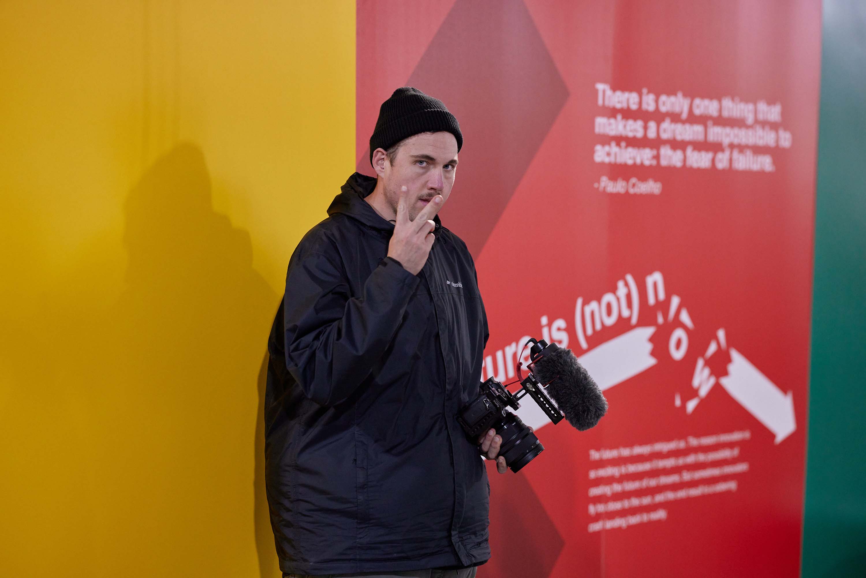
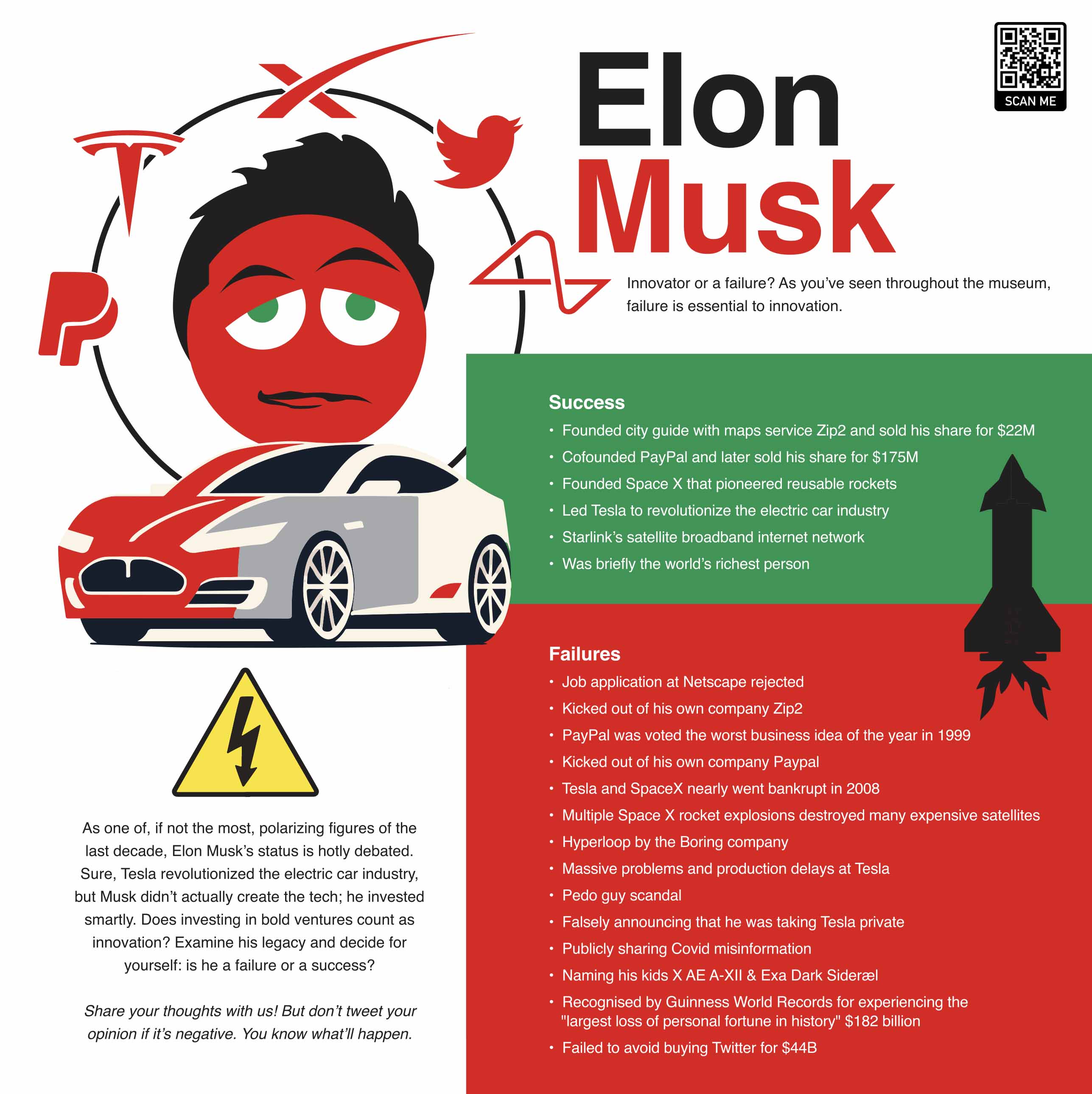
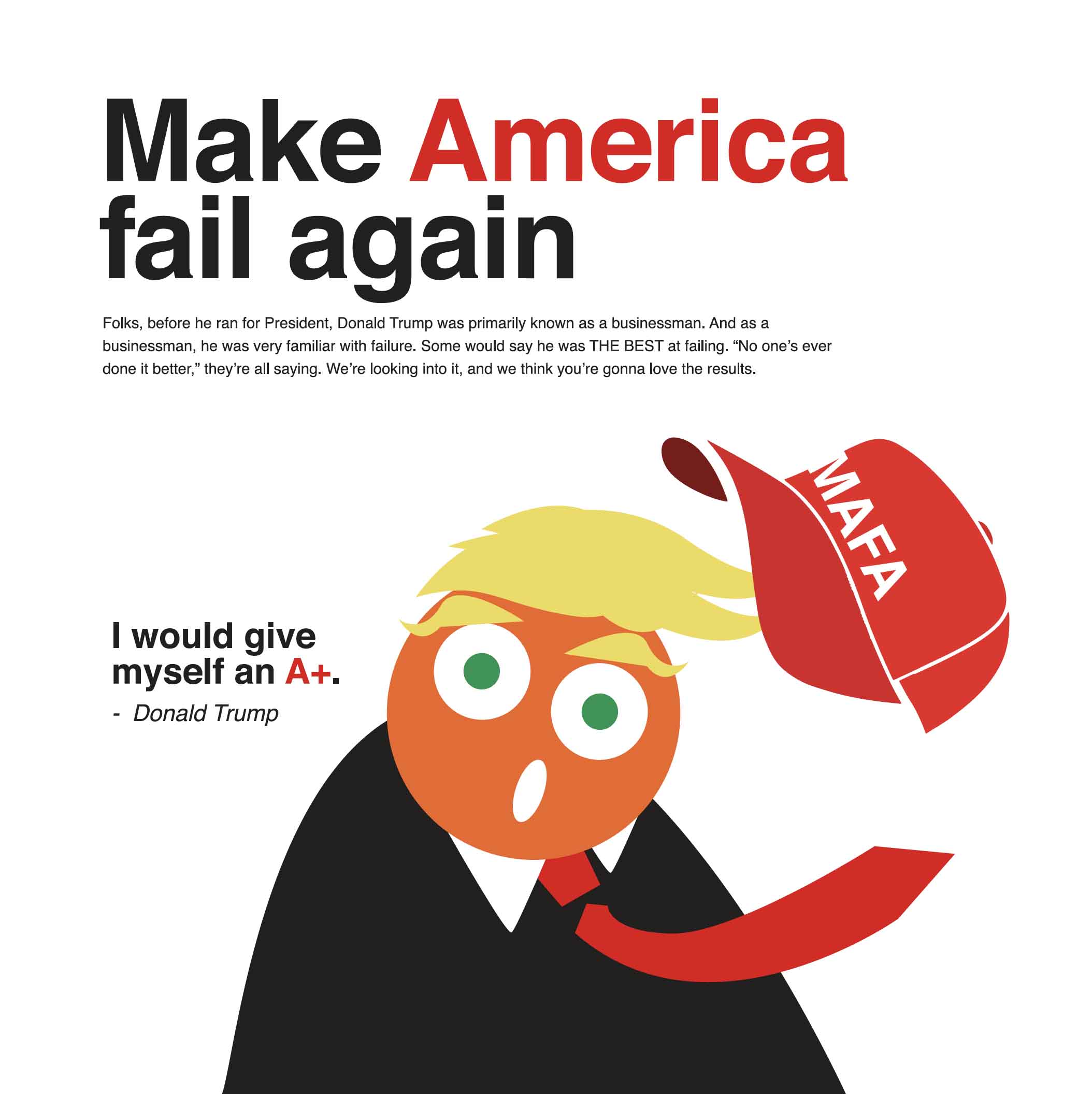
My goal was to communicate ideas as quickly and clearly as possible. Can somebody recognize who this person is almost instantly? Can somebody understand the joke or the failure being discussed without reading a paragraph of text?
One of the funniest examples was illustrating public figures, How do I make Donald Trump look like Donald Trump without making him orange? The brand system didn’t allow for those kinds of shortcuts. Everybody existed within the same visual language. So the challenge became reducing people to their most recognizable traits while staying faithful to the established style. It became a fascinating design puzzle.
What was your role?
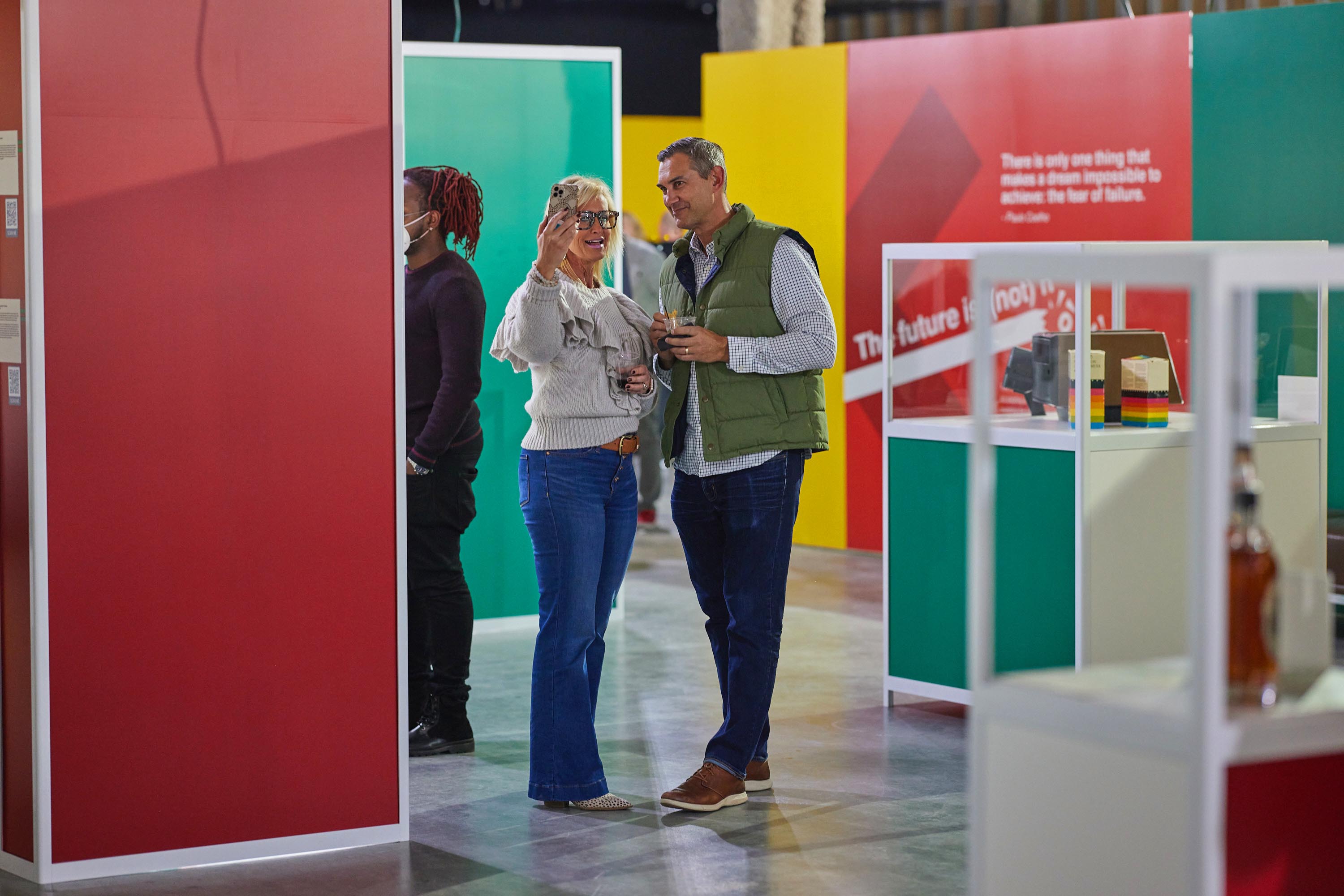
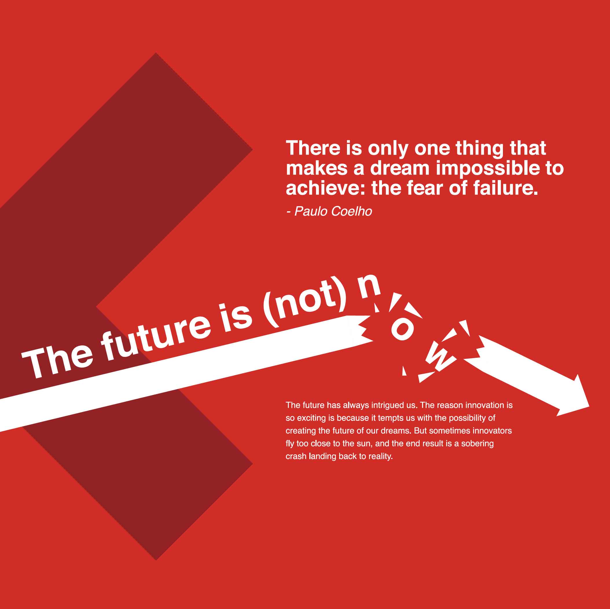
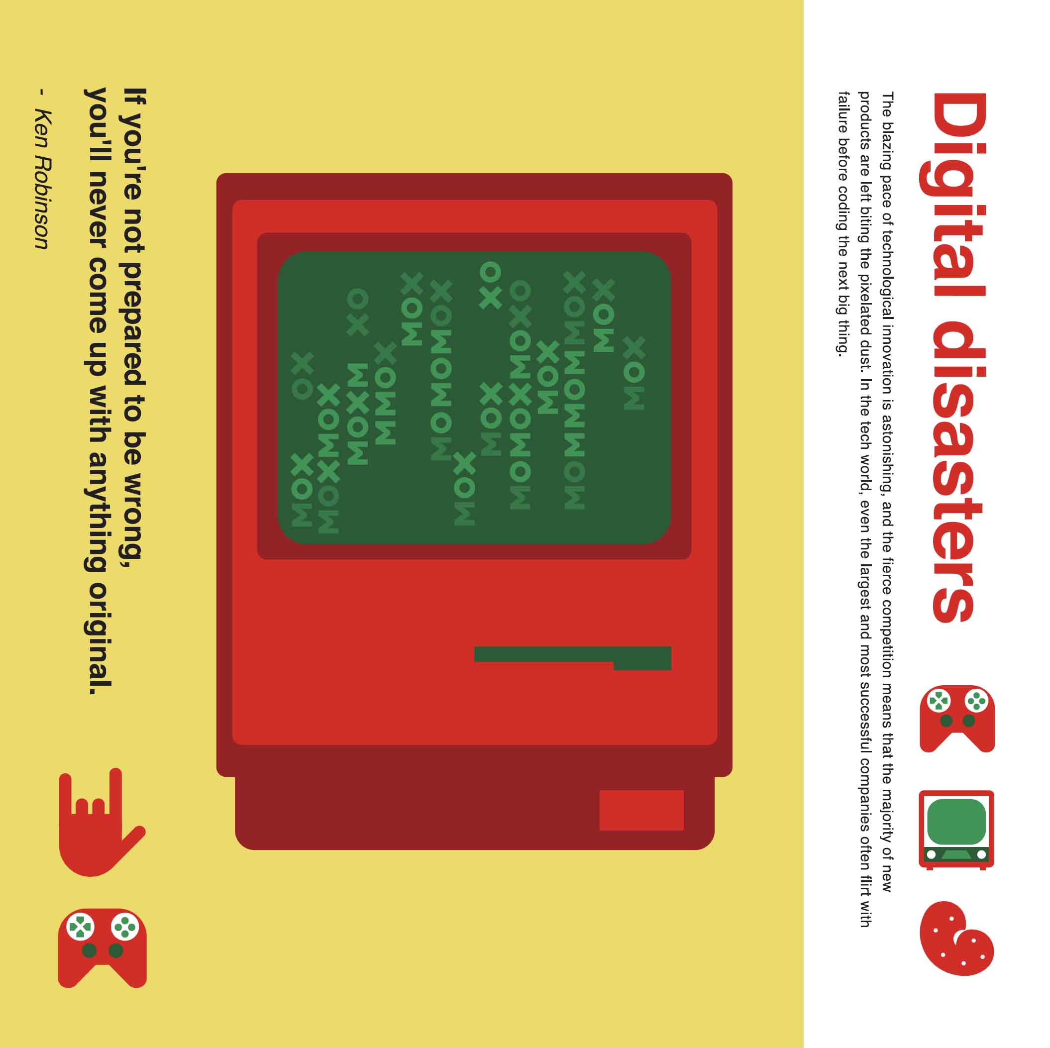
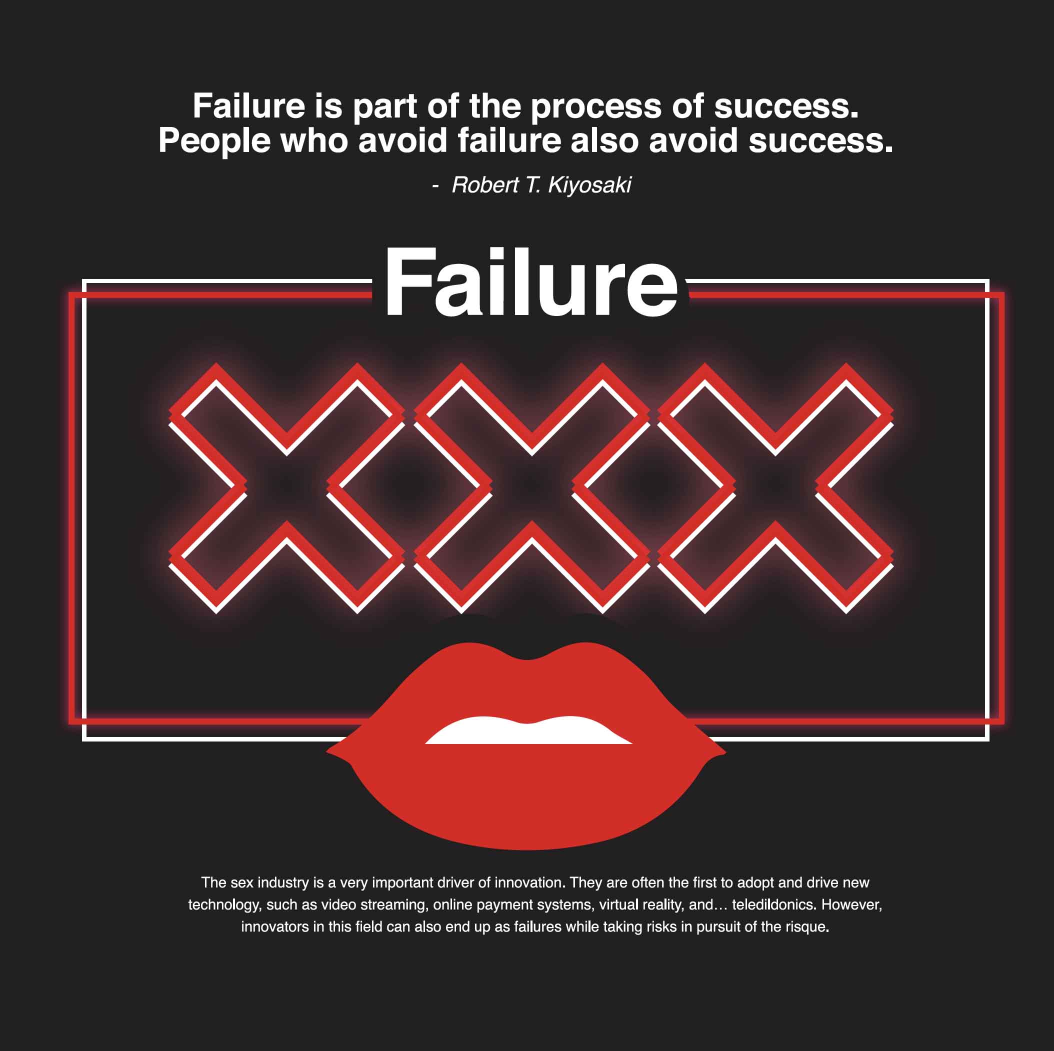
My primary responsibility was creating the illustration system used throughout the exhibition. That included:
- Large-scale wall graphics
- Character illustrations
- Environmental artwork
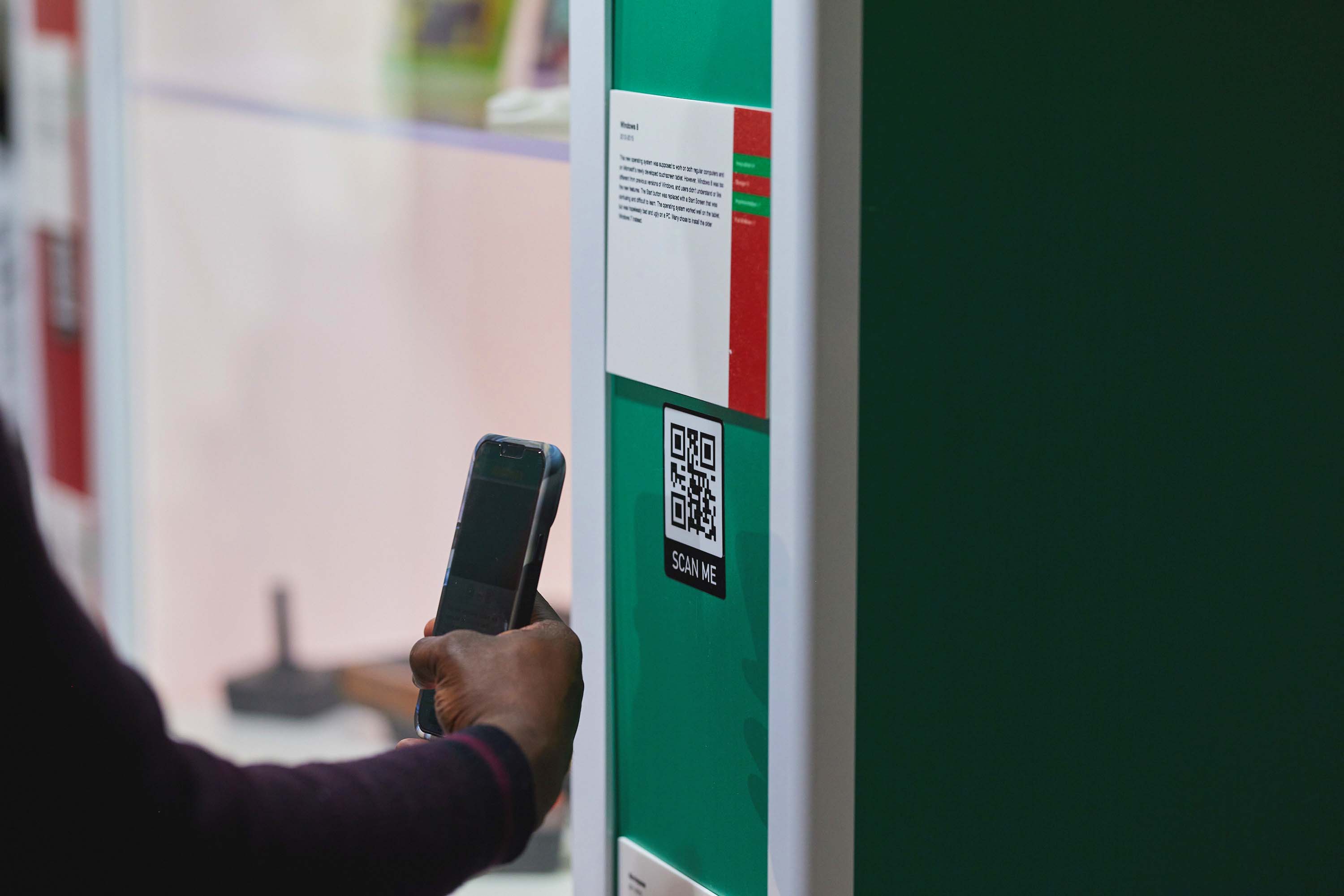
- Signage
- Exhibition graphics
- Visual assets supporting the museum experience
The conceptual direction and exhibit planning came from Eric Leong and the broader Museum of Failure team. My role was bringing those concepts to life visually while making sure everything felt cohesive inside the existing brand framework.
How did you know it was working?
Initially, success came from the internal response from the MOF team, the work was landing, the team was excited, and the concepts were translating.
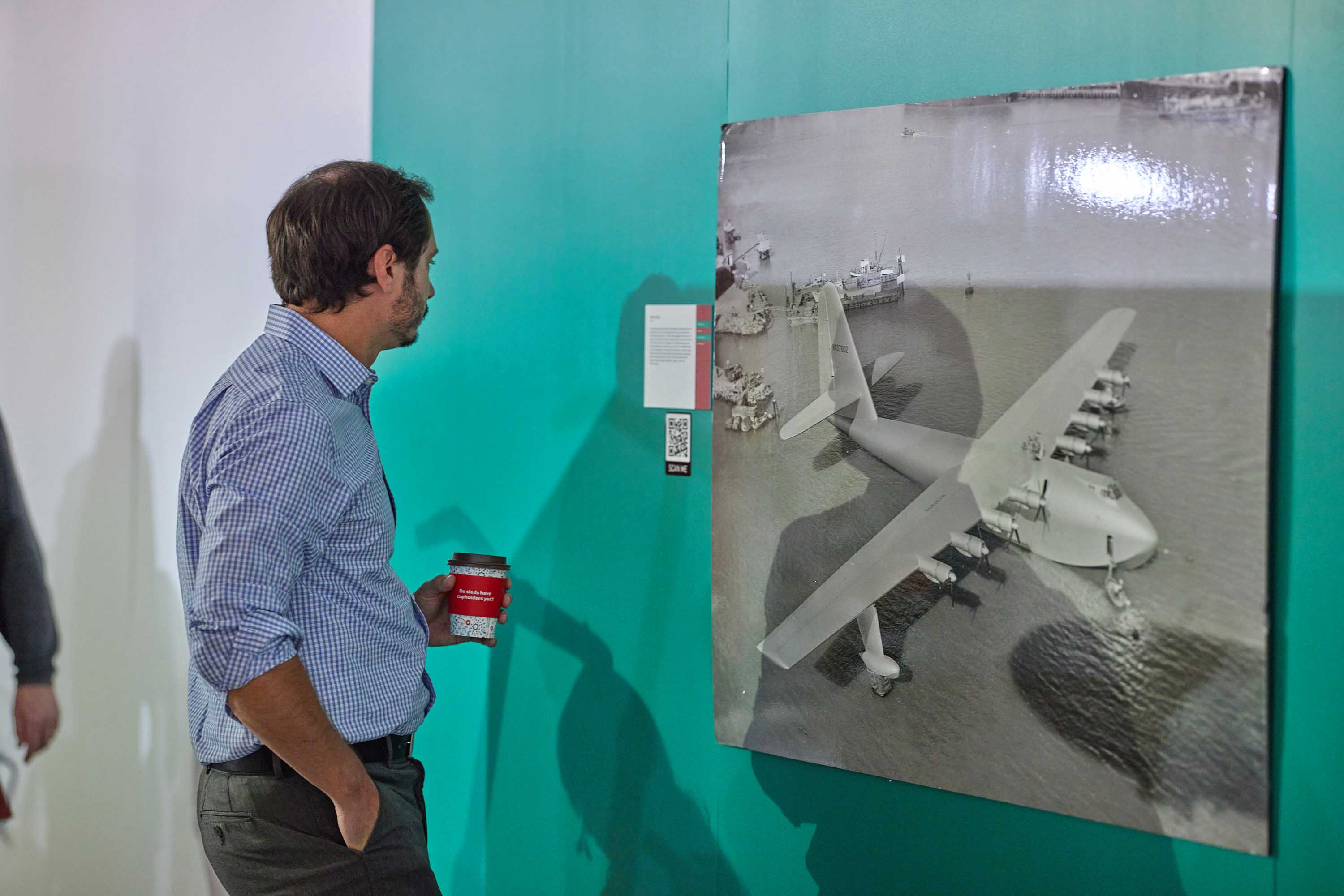
The really rewarding moment came later when Museum of Failure started receiving significant media coverage as it traveled from city to city. I would suddenly find myself seeing my work in news stories, interviews, social media posts, and television segments. That’s always a surreal feeling.

Why does this project matter?
Museum of Failure is portfolio-worthy for a very different reason than most of my other projects. This project demonstrates my ability to work within someone else’s system and still contribute meaningful creative value.
Ironically, this monument to failure, and the creative collaboration, was anything but a failure. Go see them in your city if you get the chance!
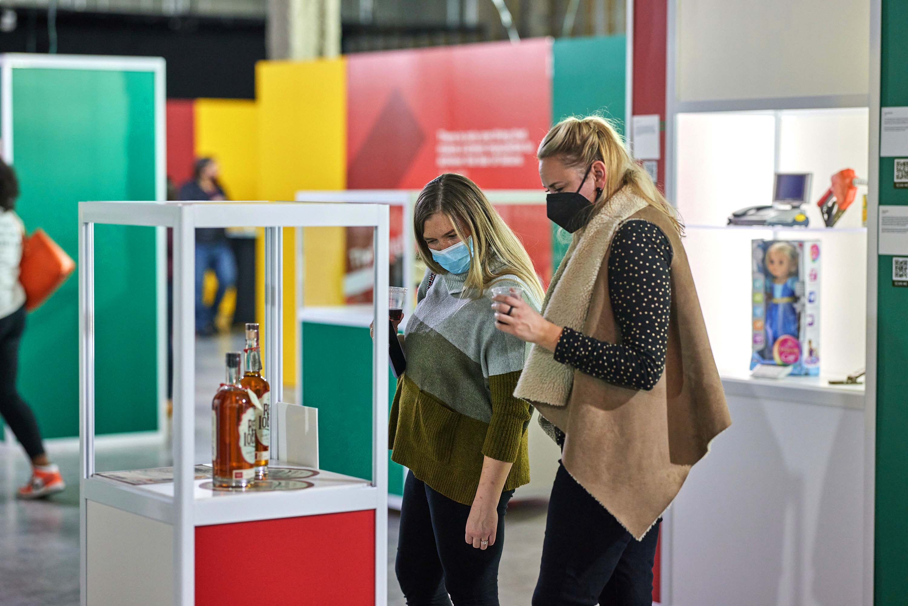
In the press
Museum of Failure earned significant media coverage as it traveled. Here’s a sampling of the press, including a few segments that had some fun with the concept.
Museum of Failure in the press
Exhibition coverage
Media feature
News segment
Gutfeld on Museum of Failure
Press coverage